
You’re in for an extraordinary treat today as we welcome a truly special guest! My dear friend, the incredibly talented Sylvie Shirazi, has graced us with her expertise to share invaluable insights into the world of photography, particularly focusing on the fundamental visual elements of design. If you haven’t yet discovered Sylvie’s captivating blog, Gourmande in the Kitchen, you are truly missing out on a culinary and visual feast. Her platform isn’t just a treasure trove of magnificent, easy-to-follow recipes; it’s a breathtaking gallery where every photograph is a piece of art, a delectable visual treat that truly is like candy for your eyes! Sylvie is not merely a brilliant photographer; she is also a gifted food writer whose passion shines through every post. Every conversation with her is a learning experience, an opportunity to glean wisdom from a master. What she generously shares with us today is the kind of professional knowledge that many pay a significant sum to acquire. So, take a deep breath, grab your camera, and let’s embark on this enlightening journey into the art of food photography!
Mastering Food Photography: Understanding the Visual Elements of Design
Embark on a creative journey to master the art of food photography. This comprehensive guide will help you understand and apply the basic visual elements of design and composition, enabling you to create stunning, harmonious, and impactful food photographs that truly tell a story.
The Language of Photography Part I: Deciphering the Visual Elements of Design
At the very heart of every compelling photograph, especially in the specialized niche of food photography, lie three indispensable pillars: the subject, the composition, and the lighting. These aren’t merely components; they are the bedrock upon which the entire visual narrative rests. Should any of these fundamental elements be weak or poorly executed, no amount of sophisticated post-processing or advanced editing techniques can truly salvage the image. It becomes glaringly evident that the technical specifications of your camera—your chosen aperture, f/stop, or ISO settings—become secondary. Without an intrinsically interesting subject, a thoughtfully arranged composition, and exceptional lighting, a photograph will inevitably fall flat, lacking the crucial ingredient for success: genuine impact.
Developing the ability to effectively “read” a photograph is perhaps one of the most powerful skills a photographer can cultivate. This analytical approach provides a profound insight into the mechanics behind truly great images, offering a clear roadmap for how to consistently achieve those critical elements within your own photographic work. It’s about moving beyond simply seeing to truly understanding.
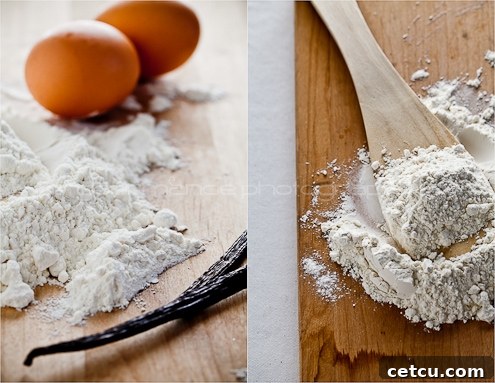
Reading a photograph is an in-depth study, a deliberate process of deconstructing an image to understand not only how it was physically created but also the underlying thought process, intentions, and decisions of the photographer. Every time a photographer presses the shutter, they are making a series of conscious and subconscious choices about the quality and quantity of light, the strategic arrangement of visual elements within the frame (composition), and the selection and presentation of the content itself—the subject and its intended meaning. This intellectual engagement with images transcends passive viewing.
Each photograph, like a finely crafted story, offers a multitude of interpretations. By keenly observing and interpreting the specific choices a photographer has made—from their use of light to their arrangement of elements—we gain invaluable knowledge that directly contributes to the refinement and improvement of our own photographic skills. It’s an ongoing dialogue with the art form. To truly elevate our capabilities as photographers, we must dedicate time to actively studying the work of others, learning from their successes and critically analyzing their approaches. This collaborative learning, even if indirect, is essential for growth.
While you may already possess an instinctive appreciation for certain images, an innate understanding of what visually appeals to you, learning to consciously analyze the basic visual elements provides a deeper, more articulate appreciation. By understanding the language a photographer uses to communicate, you can better articulate *why* you are drawn to a particular image or *why* another fails to resonate. This analytical framework transforms subjective preference into objective understanding, allowing for more intentional and effective creation.
As previously highlighted, a truly successful and resonant image is the harmonious culmination of several interwoven factors, most notably superior lighting, thoughtful composition, and compelling subject matter. However, for Part I of this critical discussion, our primary focus will be on the fundamental building blocks that form the bedrock of all visual arts – these are universally known as the elements of design. Understanding these elements is the first step towards creating visually powerful photographs that captivate and communicate.
Remember that these understandings of various visual elements should be seen as flexible guidelines, not rigid rules. Your personal instincts and creative vision are equally vital. Don’t shy away from experimentation, from trying unconventional approaches, or from embracing the unexpected. Learn as much from your photographic triumphs as you do from your perceived failures; each moment behind the lens offers a valuable lesson. Surround yourself with a community of fellow enthusiasts who share your passion for photography. Engaging with and learning from others who possess similar enthusiasm will accelerate your skill development exponentially, fostering both growth and inspiration.
The Essential Visual Elements: Tools for Engaging Storytelling
Not all visual elements are necessarily present in every single image, nor should they be. The conscious decision of what you choose to include or, equally important, what you deliberately exclude from your frame, fundamentally shapes the narrative and dictates which elements will most effectively capture and hold a viewer’s attention. Each element serves as a powerful tool in your photographic arsenal.
-
Lines: Guiding the Eye and Creating Dynamics
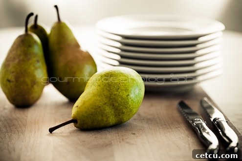
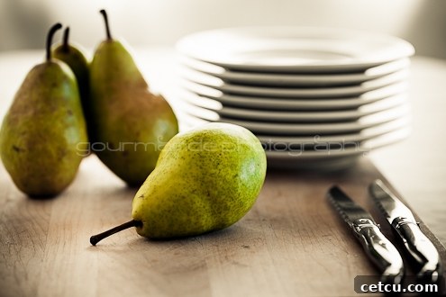
Lines are incredibly powerful visual elements in photography because they possess an innate ability to lead the viewer’s eye through the composition. They act as visual pathways, drawing attention to key focal points and often implying motion, direction, or even a sense of stillness. A line can manifest in various forms: it can be crisp and straight, elegant and curved, stately and vertical, grounding and horizontal, or dynamic and diagonal. Beyond explicit lines, an ‘implied line’ can be created when several distinct points are strategically positioned within the frame, prompting the viewer’s brain to connect them visually. Through the skillful application of linear perspective, lines can also dramatically enhance the perception of depth within an image, making a flat two-dimensional photograph feel three-dimensional. Generally, a vertical orientation is often favored for images dominated by vertical lines (like tall glasses or standing bottles), while a horizontal orientation is more suitable for compositions featuring prominent horizontal lines (such as a spread of ingredients across a table).
Consider: When observing a food photograph, identify the various lines present. How are these lines arranged within the frame? Do they lead your eye towards the main subject, or do they create a sense of movement or stability? For instance, a curved line of steam rising from a hot dish can create a sense of allure, while parallel lines of cutlery might ground the composition. Thinking about how to incorporate leading lines with your ingredients or props can dramatically enhance the viewer’s engagement.
-
Form/Shape and Space: Defining Subjects and Emptiness
In the visual arts, forms are essentially three-dimensional shapes, adding depth and volume, while shapes are two-dimensional outlines. Shapes can be wonderfully diverse: they can be irregular and organic, echoing the natural world (think of a gnarled vegetable or a perfectly imperfect cookie), or they can be precisely geometric, such as perfect circles, sharp triangles, or orderly squares (like a stack of pancakes or a neatly cut piece of cake). Space, on the other hand, is intimately defined and determined by these forms and shapes; it is the void or the area that exists between and around objects. The actual subjects or objects within an image create what is known as positive space, drawing the viewer’s focus. Conversely, the areas of emptiness or void surrounding these positive shapes constitute the negative space. It is absolutely crucial to pay as much, if not more, attention to the negative space as you do to the positive space. Manipulating the amount of space around an object—either increasing or decreasing it—profoundly affects the balance, impact, and overall perception of the image. For instance, a generous amount of negative space can make a single food item feel more significant and isolated, conveying elegance, while tightly cropped compositions can create intimacy. Shapes can be made even more dominant and impactful within a composition by cleverly placing them against a contrasting background, causing them to truly pop and command attention.
Consider: Take a moment to analyze your food subjects. Do you primarily see organic, natural shapes (like a fresh fruit, a rustic bread, or a flowing sauce) or more geometric, man-made forms (like a perfectly sliced piece of cake, a neatly arranged stack, or a symmetrical dish)? How do these shapes interact? How does the empty space around your food subject contribute to the overall feel of the image? Is there enough negative space to let your subject breathe, or does a tighter crop create a more intense, focused impression? Experimenting with how much ‘air’ you give your subject can dramatically alter the image’s narrative.
-
Color: Evoking Emotion and Enhancing Appeal
We are profoundly influenced by color, responding to its nuances on multiple sensory and emotional levels. Color serves as a defining and accentuating force for lines, shapes, forms, and space, adding richness and depth to the visual experience. When used skillfully, color can dramatically increase interest and effectively guide the viewer’s eye directly to the focal point of the image. Conversely, when misapplied or used without intention, color can become a powerful distraction, pulling the viewer’s attention away from the intended subject. Beyond its compositional role, color holds immense power in impacting mood and psychological response; certain serene tones can evoke a calming, comforting effect, while other vibrant hues can convey an irresistible sense of energy, freshness, and dynamism. There are three primary components that define any color: hue, which refers to the pure shade or name of the color itself (e.g., red, blue, green); value, which describes the lightness or darkness of a color, ranging from a pale tint to a deep shade; and saturation, which measures the intensity and vividness of a color, indicating how pure or muted it appears.
Consider: What color palette dominates your food photograph? Are the colors bright and vivid, or are they muted and soft? Are they predominantly light and airy, or dark and dramatic? How do these color choices collectively affect the overall mood and appeal of the image? For food photography, understanding complementary colors (like red tomatoes against green basil) can create visual pop, while analogous colors (like shades of orange and yellow in a citrus tart) can create harmony. Think about how colors can make food look more appetizing or reflect a particular season or occasion.
-
Texture: Adding Depth and Sensory Appeal
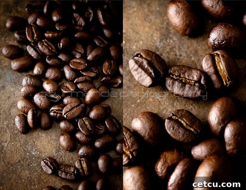
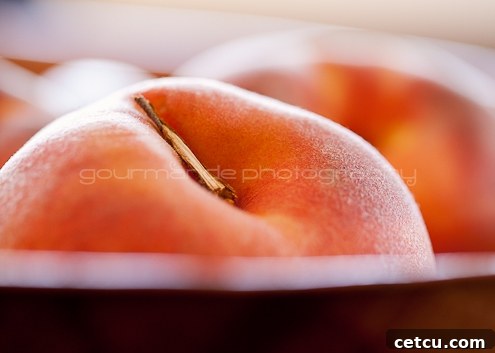
Texture, in photography, refers to the perceived surface quality of the objects captured within the image. It’s what gives a two-dimensional photograph a sense of touch, making it feel more tactile and real. Textures can range from strikingly rough or elegantly smooth, to invitingly soft or resiliently hard. While we experience actual texture through physical touch—feeling the grit of sand, the silkiness of fabric, or the intricate patterns on a leaf—photographs allow us to expertly simulate or imply these textures. The magic of texture in food photography lies in its ability to add depth, realism, and sensory appeal, making the viewer almost taste or feel the food. Textures are most effectively highlighted and brought to life when light interacts with objects from various angles. A raking light, for example, can dramatically accentuate the crust of a loaf of bread, the glistening condensation on a cold drink, or the delicate crumbs of a pastry, drawing the viewer’s eye and evoking a powerful sensory response.
Consider: Which specific textures are prominently featured and highlighted within your food photograph? Is it the crispy skin of a roasted chicken, the velvety smoothness of a soup, the crumbly nature of a dessert, or the vibrant freshness of a dewy fruit? How do these textures interact with and complement the other elements of design, such as lines, shapes, and colors? For example, a rough wooden backdrop might enhance the natural, organic textures of fresh produce. Deliberately using light to cast shadows and highlights can turn a flat surface into a fascinating landscape of tactile sensation, greatly increasing the appetite appeal of your culinary creation.
These foundational elements of design—Lines, Form/Shape, Space, Color, and Texture—are more than just abstract concepts; they are the fundamental components of effective composition. They serve as the structural framework of any powerful image and provide the photographer with a robust set of tools to begin their creative journey. Achieving a successful and truly harmonious composition involves not just understanding these basic tools but masterfully integrating them with the broader concepts known as the principles of design. These principles, which govern how the elements are organized and arranged, will be the exciting subject of Part II of “The Language of Photography,” marking the beginning of an in-depth series on general and specialized food photography topics on my blog, Gourmande in the Kitchen. I sincerely hope you’ll join me there to continue this fascinating exploration of visual storytelling. A huge thank you to Cheryl for graciously hosting me here today!

About Sylvie Shirazi: The Culinary Visionary Behind Gourmande in the Kitchen
Sylvie Shirazi is an acclaimed freelance food photographer and a passionate food writer whose work transcends mere recipes, celebrating the profound joy that food infuses into our daily lives. Through her exquisite blog, Gourmande in the Kitchen, Sylvie shares her culinary philosophy, which is elegantly distilled into her simple yet profound motto: “cook simply.” She firmly believes that truly good food is never about fussiness or pretension; rather, it’s about authenticity. It’s simple, it’s real, and it’s always made with genuine love for the cherished people in our lives. With every dish she creates and every photograph she captures, Sylvie aims to do more than just share a recipe. She aspires to ignite a spark of inspiration in others, encouraging them to trust their culinary instincts, to savor and celebrate their unique taste buds, and ultimately, to discover a profound sense of confidence and joy in their own kitchens.
Connect with Sylvie and Explore More:
Follow Sylvie’s culinary and photographic adventures on social media: